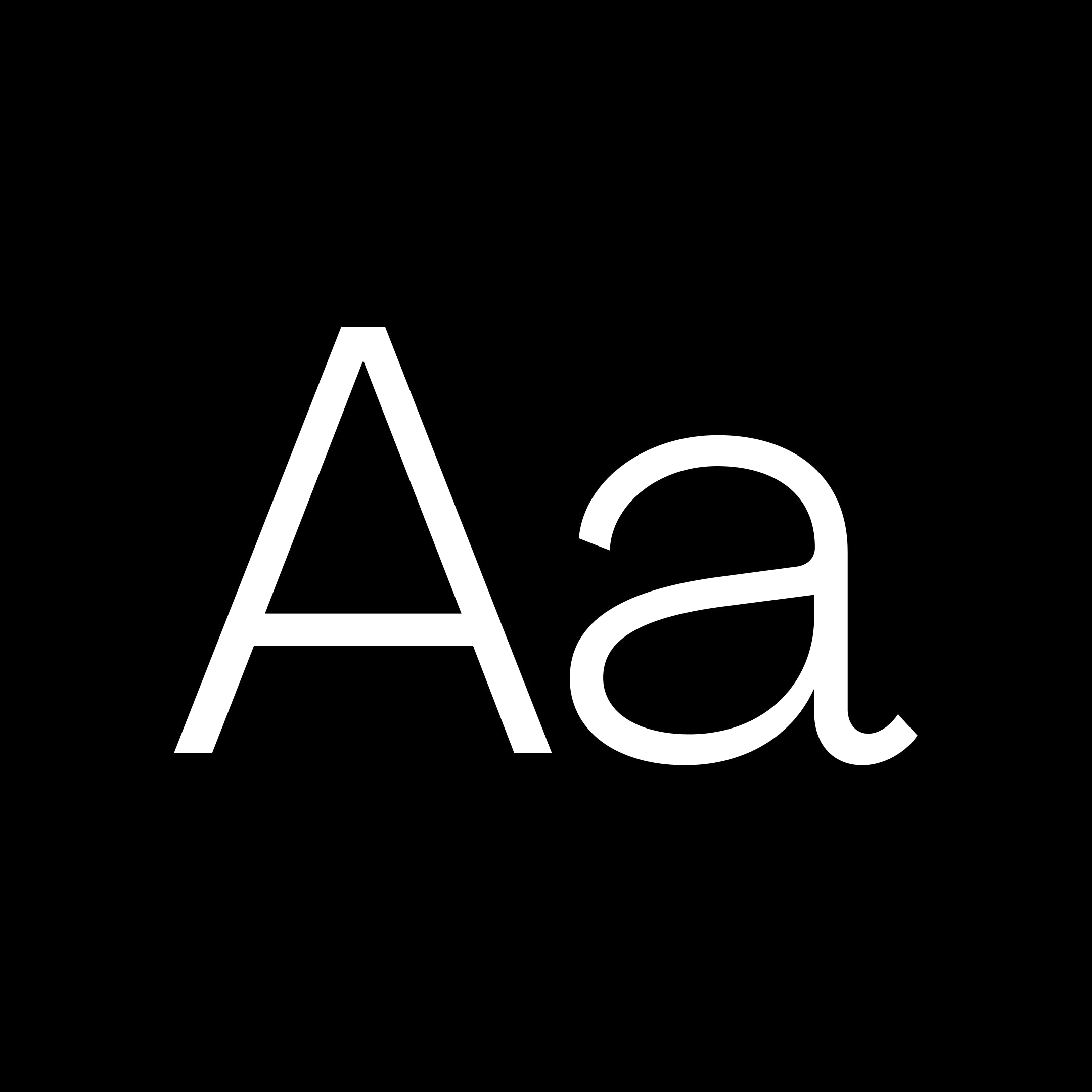
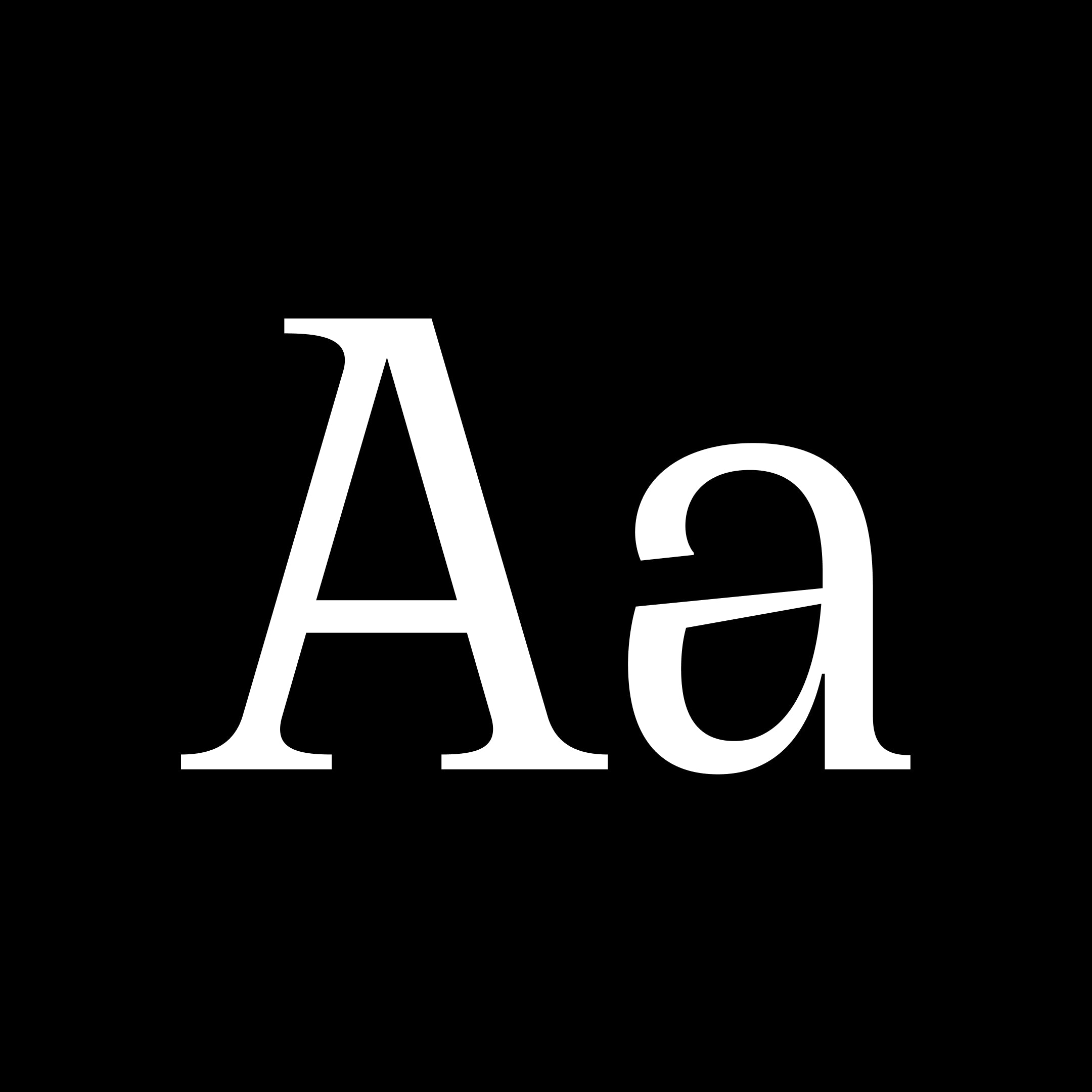
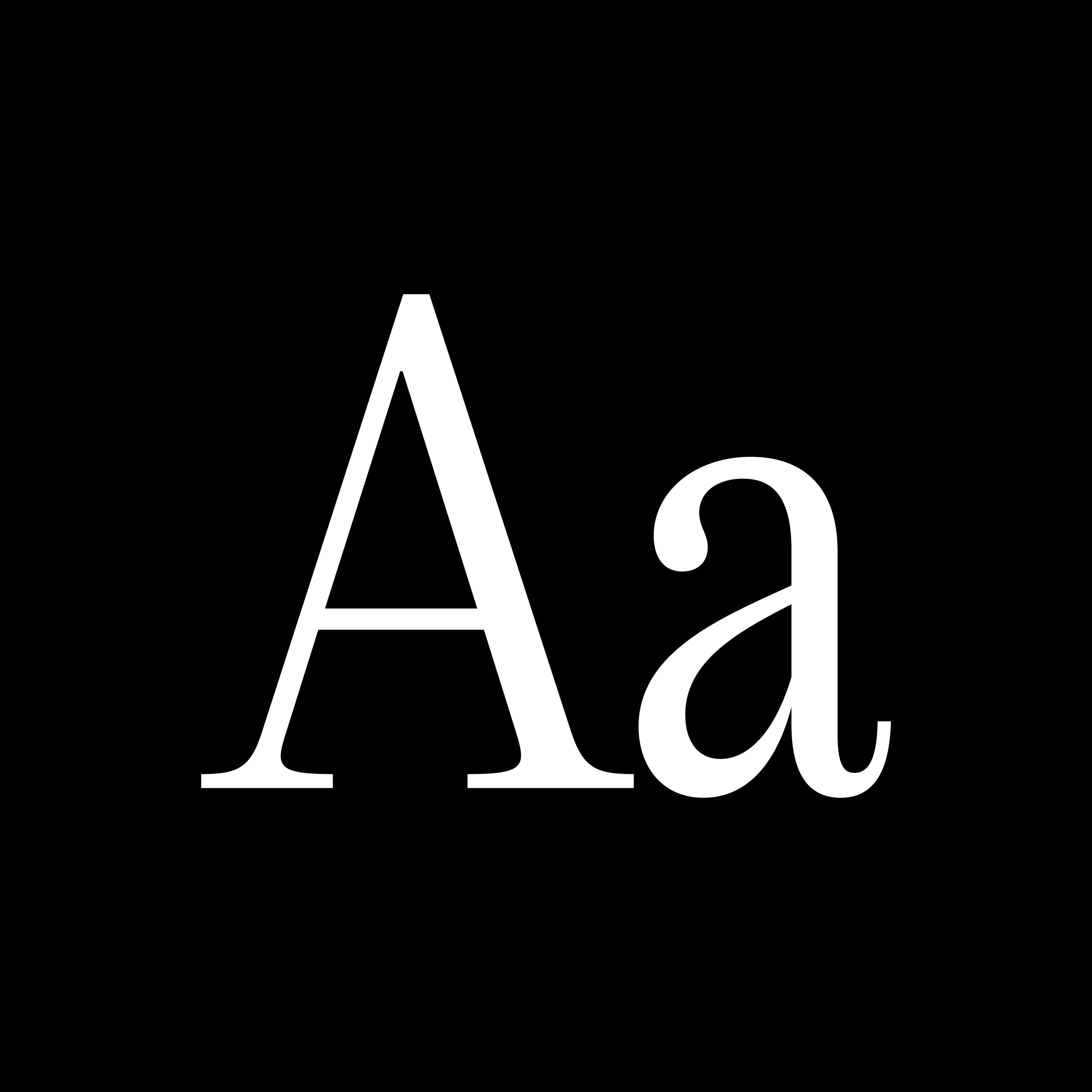
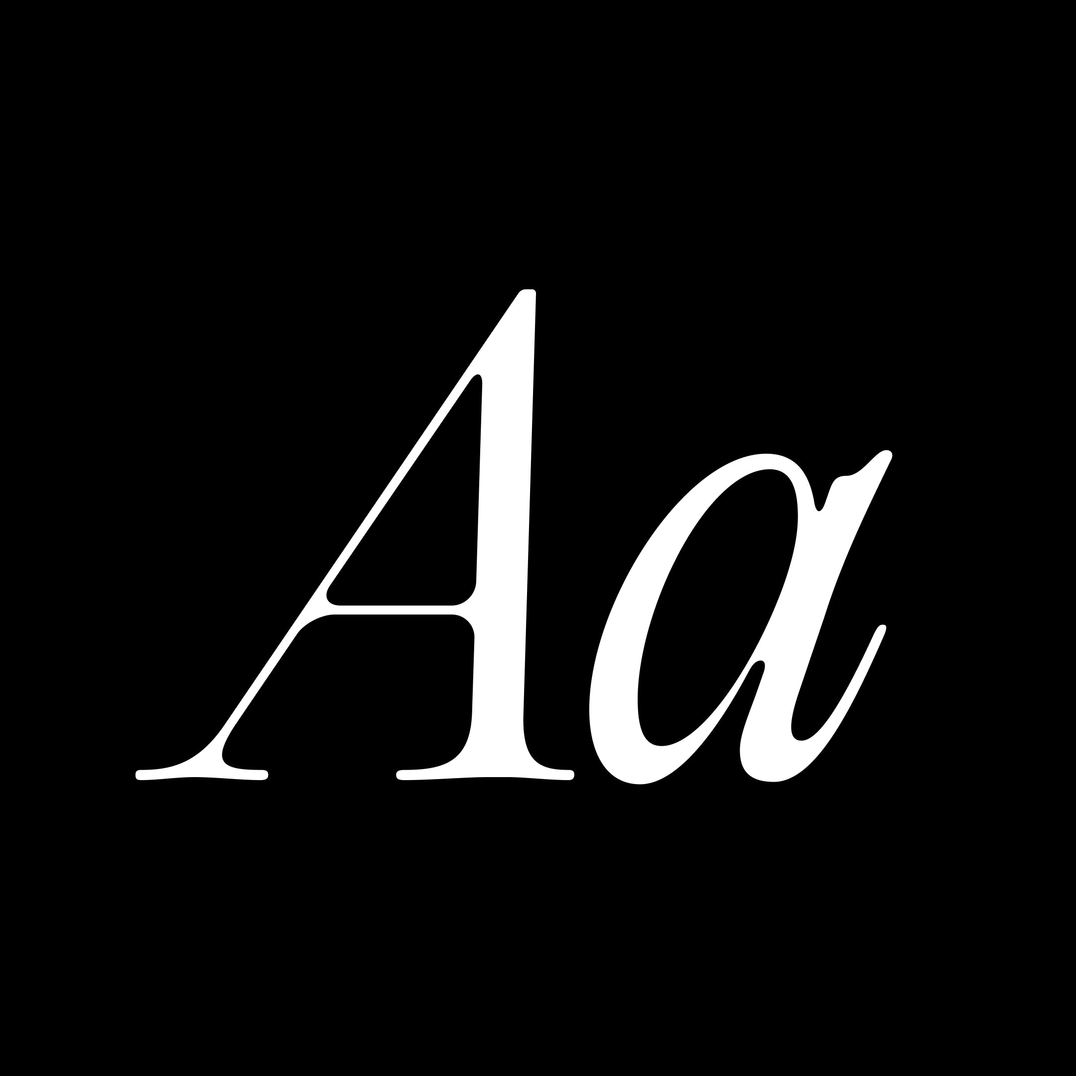
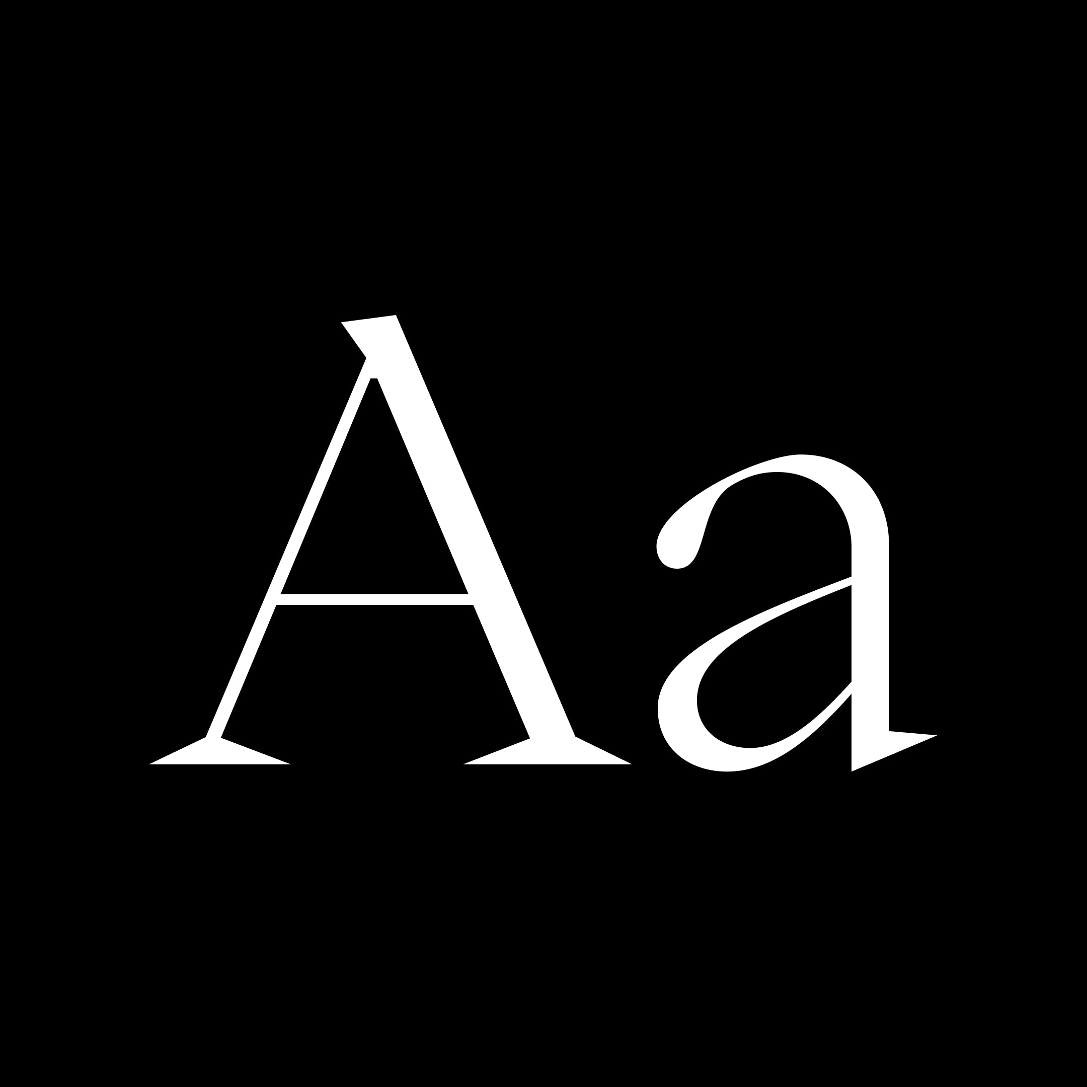
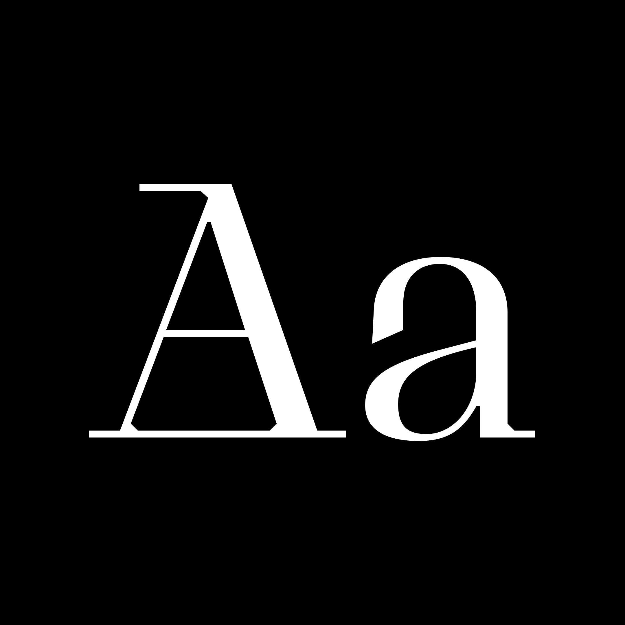
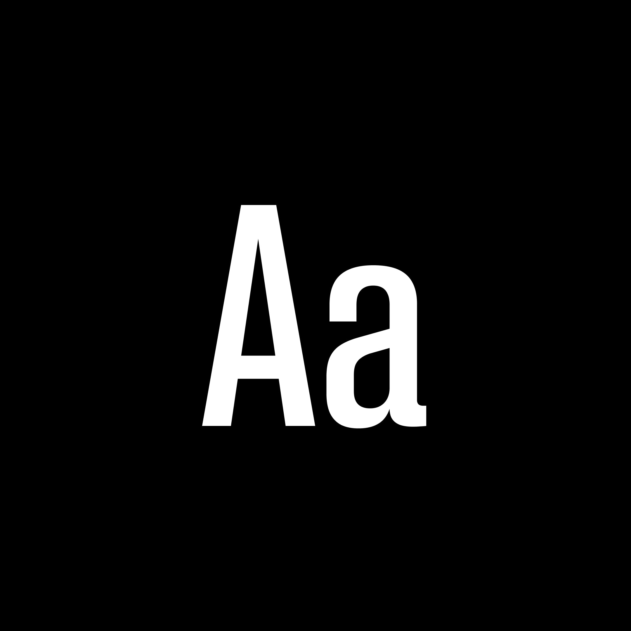
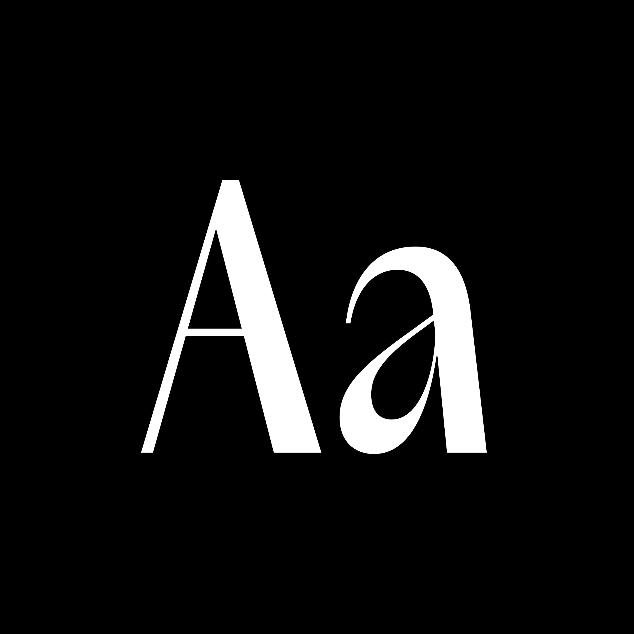
Acma is an irreverent typeface with a powerful elegance. It is ultimately precise and subtle yet it remains flowy and temperamental. The design was inspired by the Japanese modernist aesthetic as well as the fashion world [past, present and future] for its unapologetic nature and opulence through the purity and the tension of its lines yet unconventional forms and rhythms. The design of the lowercase “a”, gave the tone to the whole family, which quickly became Acma. Its luscious curves, wide alternates and deep contrast will embellish any design endeavour it takes on. Guaranteed. It is a highly contrasted, narrow sans serif, ranging from thin to black. Originally intended for editorial headlines, Acma can be use in a variety of purpose starting at 12 point. Acma includes a second set of wide uppercase, and alternative key characters in the lowercase. The use of these characters allows the designer to create a variety of unexpected moments. Acma comes in 10 weights with a variable cut for maximum versatility. It is a celebration of idealistic beauty, express through tension, balance, unorthodox shapes.
Pangram Pangram Foundry
Pangram Pangram Foundry offers a variety of high-quality, trend-conscious fonts that are free to try. Their typefaces are designed with attention to detail for everyday design needs.
Agrandir is a contemporary serifless type family that celebrates the beauty of being imperfect. It was designed to be a brave antipode to neutral modernist fonts. Agrandir accepts its own shapes as they are – unaligned, quirky and funky. It celebrates humanity, not machines. The type family consist of 74 fonts: 7 weights × 5 widths × Italics + 4 Text styles. Or just one 3-axes variable font. Agrandir features a fairly good number of OpenType stylistic alternatives, which can be turned on for individual letters or as overall presets – Default, Grotesk and Geometric. With its wide variety of flavors and super tight spacing Agrandir is gonna do a good job for big size headlines, websites, logos and posters, and its new text styles are great for body copy.
The Harmonious Collision of Brutalism, Minimalism, and Aerospace. A breath of fresh creativity. The newest typeface of pangram pangram, originally designed by Mat Desjardins and expanded by Caio Kondo from Inari Type, embraces the duality between simplicity and experimentation, offering a visually appealing and intriguing aesthetic, a true pangram pangram font. Step into a world where design boundaries are pushed, and artistic influences collide. We're excited to unveil our latest typeface creation, Air. Inspired by a captivating fusion of brutalism and minimalism, with a subtle nod to the sleek lines of aerospace design, Air brings a fresh and distinctive touch to the typographic landscape. Its massive character map includes a variety of alternate characters, allowing for greater customization and creation possibilities. Additionally, abundant ponctuations and a set of arrows are available, adding versatility and functionality to your projects. In addition, Air offers a huge range of weights, 36 in total. From mono style to italic, the typeface even has a variable version that unites these axes in a single file.
Casa Stencil is a beautiful, elegant stencil font that features soft curves and a sense of erosion. Its presence will definitely make your designs unique. It is made for all your title and logo needs. 8 Digital Flower Posters (8.5in x 11in) come with all commercial license purchases
Charlevoix Pro is a beautiful display typeface inspired by one of Quebec's greatest region. It is strong and bold like Charlevoix's hills and mountains and fluid like the water of the Saint-Laurent river. It's slightly rounded corners give this font a human touch when it's used in titles.
Chronos Serif is an elegant display serif with three variants. Stroked, Hatched and Filled. Each style has its own unique flavor. Loaded with details and elaborate curves it will surely uplift your high end projects.
Cirka is an elegant typeface that combines classic forms u0026amp; a vertical axis with sharp, pointy serifs. It works great set large on posters or headers, or small, as body text. Its personality stems from the combination of the subtle details in every curves and the flamboyant, spikey serifs. Reminiscent of the 'Italian Wedge' shape from Lamborghini.
A precise and elegant narrow serif that was designed for the long-form copy with a big enough personality to make a statement as a title. It is perfect to give your design that mid 90s retro feel while being rich and contemporary. In its lighter weights, Editorial New is elegant, refined and subtle. It’s easy to imagine it being used for the fashion industry in brands or magazines. With its precise legibility, the regular weight is perfect for that long-form editorial content but it is far from being blend. It will give your text a unique feel and style. The heavier weights are made for big statements. The curves are lushier, a bit more exaggerated to give these weights and ultimately your designs more personality. Combined with the luscious and curvy italics, this font is a must try on every design.
Editorial Old is a 'fresh' take on one of our most popular classics Editorial New. So to understand Editorial Old we need to go back to Editorial New's Concept for a second. The concept of Editorial New was rooted in 70s u0026amp; 80s vintage ads. With its narrower stance and elegant curves, this workhorse serif quickly became one of your favourite. Stemming from that success, we had the idea to push this vintage concept a bit further in this spin-off. What if Editorial New got Old??Its curves would be less tense, its connections a bit more relaxed, its ligature more droopy and more present, its terminals softer. Alongside this idea of the vintage ads, we created a melting, eroded version of our timeless classic with a ton of luscious ligatures. Two Times Elliott led visual campaign embodies this idea of agelessness through refined curves, etched and molded oddities, trinkets and jewelry.
Editorial Sans is a typeface that seamlessly bridges the past and present, embodying a retro-modern aesthetic. Building on the legacy of its serif counterpart, Editorial New, it retains the same proportions and metrics but with a sleek sans-serif design. Editorial Sans offers a clean and contemporary look while honoring its classic roots, making it ideal for a variety of design applications where elegance and modernity intersect. Its versatility shines in both digital and print mediums, from editorial layouts and branding to web design and advertising. Whether you’re crafting a minimalist logo or a sophisticated magazine spread, Editorial Sans provides the perfect balance of timeless charm and modern sophistication. It comes in 16 meticulously crafted styles with true italics — a rare feature in Sans-serifs.
Eiko is an indisputable statement of elegance and refinement. Every curves and bezier points were applied with a sense of purpose. It is inspired by the work of Eiko Ishioka, a multitalented Japanese artist, this typeface seeks to convey the same aspect of her work in these typographic explorations. It is an original serif font with high contrast, including the syllable alphabet kana, hiragana u0026amp; katakana, it is ideal to pair with other kanji fonts of the Japanese mincho style. Its resources include a large repertoire of Japanese punctuations, stylistic sets with circular and square numbers, vertical written, subscript and superscript numbers, mathematical symbols, meteorological symbols, ligatures, arrows and many alternates. And now: a new basic educational set with 81 kanjis and full italics!
Formula is a complete and versatile typeface that bold racy look with the flexibility of a grotesque. It comes in many styles from Condensed to Extended through a comprehensive set of weights from Thin to black all with their italic counterparts. Formula was designed to make an impactful statement in your designs, wether you are using the Condensed Black Italic style for your race-inspired campaign or the Normal Regular weight just to go along as body text, this typeface has got it all!Download it for free, get set and go!
PP Fragment is born from vintage lettering and signs, bridging 19th-century letterforms and contemporary typography. Pangram Pangram’s 35th release uses the latest technology, gracefully oscillating between an elegant, highly contrasted Serif face, a revival mid-serif called Glare, and a strong Sans, each with distinct features yet perfectly complementary. It comes in 4 preset cuts, Sans, Serif, Glare, and Text, each with unique personalities and quirks. Each weight counts 581 glyphs with plenty of alternate symbols to achieve the best-desired result for your next design. Its power and versatility also comes from its 32 very distinct and unique weights plus italics! These weights were carefully crafted and cut for maximum breath of ability, PP Fragment doesn’t disappoint and will surely be one of your best tools in your next design endeavour.
Fraktion Sans is a contemporary grotesque exploring the space between mechanical sturdiness and expressive clarity. While its inspiration stems from vintage signage lettering, the final design is a rather far departure. The square shape and the compact capitals are the only remnants of the original influence and when set in all-caps the industrial spirit is vaguely present. Even so the typeface has been shaped to a modern, versatile allrounder with a slight technical feel that works great in sober applications for screen and in editorial - and still maintains character to be a strong voice in branding. An exaggerated spur on the lowercase 'a' and ink traps are defining visual characteristics just as the squared-off rounds’ true verticals help create a steady cadence. The proportional Sans is complemented by a fixed-width design: Fraktion Mono. The refitted letter shapes of the monospaced design add a surprising playfulness to a genre that generally feels more technical, making Fraktion Mono’s cuts the more informal bunch of the family. Both typefaces offer plenty of typographic solutions through OpenType features like case sensitive punctuation, stylistic alternates, fractions and slashed zero. The 7 upright weights each have an italic counterpart and both sets are available as variable fonts.
Rooted in the legacy of early 20th-century modernism, Frama draws from the clarity of Futura and the expressive geometry of Avant Garde, yet establishes its own rhythm. Circles, lines, and counterforms meet in a quiet system of balance, a subtle homage to geometry’s enduring role in design. Beneath its apparent simplicity lies a careful play of proportion, bringing both precision and warmth to each word. Designed in Display and Text cuts, Frama moves fluidly across scales and weights, with stylistic alternates that open up a wide field of expressive nuance.
Fuji Sans is a beautiful bold sans-serif grotesk. Its slightly condensed feature and structured curves make this font a perfect fit for those bold designs and brands.
Gatwick is a wide incise typeface that blends a funky attitude with a refined spirit, resonating with vintage and contemporary aesthetics alike in a unique, memorable way. Unlike many fonts in its genre that rely on uniform proportions and consistent thickness to maintain a “neutral” tone, Gatwick stands out with its tapered stems, sharp terminals, and exuberant details. This distinctive flair gives it an exotic, extravagant character that immediately catches the eye of the reader. With the release of Version 2.0, Gatwick expands its versatility by introducing two new high-contrast families. These additions are ideal for crafting elegant headlines and subtitles, adding an extra layer of sophistication to any project. Designed to fly your creative work to new, unexpected destinations, Gatwick delivers the reliability and comfort of a first-class experience, while ensuring your designs leave a lasting impression.
Inspired by vintage Eastern European / Russian currents and trends, Gosha Sans is a strong u0026amp; versatile Sans with great character. Its strong lines and hard corners gives it a lot of personality without compromising legibility at small sizes. Make sure to explore it's alternates to give your designs an even more brutalist touch.
Grafier is a serif typeface that rethinks classic design in the digital era. The original source of inspiration was good old Baskerville, an English typeface from the 18th century. But Grafier went its own way and got some unique new features. The most obvious one is uncompromisingly straight serifs, which join inside the letters. This brutal linearity is also supported by distinctive flag-terminals, chopped shapes and squarish punctuation. The family consists of 10 styles: five weights from Regular to Black in two contrast variations. All the styles are also available as one variable font with two axes. Straight letter shapes makes Grafier a good pair for sans serif fonts. The typeface works perfectly in big and medium sizes; low-contrast styles are suitable for short texts as well. In such cases the readability can be improved by using stylistic alternatives that disconnect serifs.
Collaborative at its core, Hatton is a homage to the history of the London district, Hatton Garden, initially designed in partnership with London-based design studio Two Times Elliott. Nestled in London’s jewellery quarter and the design studio’s former home, Clerkenwell, Hatton Garden is the centre of the UK’s diamond trade, famous for both its high-value riches and diamond heists alike. Working together to distil the distinctive character and typographic nuances of the locale’s street signage, shop fronts and landmarks – alongside their beautiful hand-rendered imperfections – the resulting serif is a variable, pearlescent powerhouse, meticulously crafted in eight well-to-do styles. Ranging from Ultralight to Black, Hatton is both refined and robust in its aesthetic. Indicative of the area’s idiosyncrasies and the legacy left behind. Expanding on the ever-growing team of collaborators orchestrating the typographic Hatton heist, Type Designer Morgane Vantorre, alongside Pangram Pangram, has crafted the latest update of the humanist typeface. Now, with even more bang for your buck, Hatton is enviably versatile, befitted with newly crafted true italics, embellishing the serif's expressive, dignified flair alongside its recently refined curves. Its perfected proportions ensure a harmonious balance throughout, especially in the darker weights, with adjusted contrast bringing forth an engaging rhythm, complemented by a sackful of new glyphs – ready raring to adorn whatever design you desire.
Lettra is a monospaced serif typeface that explores the design challenges of modular spacing, with each character individually crafted to ensure consistent weight and proportion across the set. The design draws inspiration from the classic aesthetics of serif typewriter fonts and the detailed classifications seen in botanical drawings. It showcases a strong vertical contrast and distinctive diamond-shaped details, blending nostalgic appeal with mechanical precision. With eight weights in both upright and italic styles, PP Lettra balances structure with character and creativity. It supports a wide range of languages and features, offering a variety of alternated characters. Additionally, the font includes an experimental set of characters, such as unconventional ligatures, ordinal abbreviations, an unusual double-width uppercase and lowercase Oo, and a distinctive sigil.
Migra is a spiky serif typeface inspired by the features in migratory birds. Its weights span from an austere and elegant light cut to a hawkish and powerful black one. Packed with a set of even more gestural Italics and sundry special ligatures, this typeface is guaranteed to add sparkle and grace to any of your designs.
Mori is a versatile and sophisticated gothic sans serif inspired by contemporary Japanese design, best suited for editorial, graphic design and branding. From Thin to Black, it has 22 styles, each one includes 804 glyphs with plenty of open type features, including sets with circled and squared numbers, subscript and superscript numbers, symbols and punctuations (some of them Japanese), graphic and mathematical symbols and many alternates. Make sure to check out that geometric 'r' and double-story 'g' !!While keeping all the functionality of a workhorse Grotesk, Mori is far from being boring. You can find some unique and subtle shapes and curves that makes it stand out from the crowd. Notably it's G, number 6 and number 9 just to name a few.
Neue Corp is a versatile typeface, crafted to be the ultimate creative tool for any advertising, marketing, or digital endeavor. Designed with a broad range of widths and weights, it empowers designers and studios to adapt it to any context, from bold headlines to refined body text. Balancing character with neutrality, it combines the eccentricity of old wood type with the precision of neo-grotesques. The Black and Condensed styles are inspired by classic Hamilton Mfg. Co. typefaces, while the wide Bolds are influenced by Helvetica Extended. Regular styles draw from Univers but with softened details for a friendlier tone. Alternate stylistic sets offer even more flexibility: one set makes the typeface more geometric and neutral, while the other brings out a bold, grotesque character with added spurs. With a design spectrum ranging from subtle Thin to powerful Black, and from narrow Compressed to bold Extended, this typeface is ready to elevate any project with style and precision.


