Editorial Old is a 'fresh' take on one of our most popular classics Editorial New. So to understand Editorial Old we need to go back to Editorial New's Concept for a second.
The concept of Editorial New was rooted in 70s u0026amp; 80s vintage ads. With its narrower stance and elegant curves, this workhorse serif quickly became one of your favourite. Stemming from that success, we had the idea to push this vintage concept a bit further in this spin-off.
What if Editorial New got Old??Its curves would be less tense, its connections a bit more relaxed, its ligature more droopy and more present, its terminals softer. Alongside this idea of the vintage ads, we created a melting, eroded version of our timeless classic with a ton of luscious ligatures.
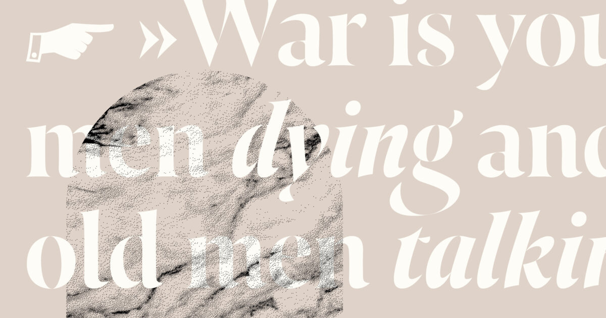
Two Times Elliott led visual campaign embodies this idea of agelessness through refined curves, etched and molded oddities, trinkets and jewelry.