Animo is a Display Grotesk Font inspired by old Spanish business signs, known as rótulos, which were created by sign-making companies in the second half of the 20th century. The design process involved repeatedly photographing and enlarging small metal type, introducing unique distortions and imperfections that resulted in unexpected beauty. Animo captures this cultural history and the charm of analogue processes, making it suitable for modern communication while embracing its distinctive flaws.
Heavyweight Digital Type Foundry
Heavyweight Digital Type Foundry is a type foundry based in Prague, established in 2013 by Filip Matějíček and Jan Horčík. It focuses on innovative typography and its applications.
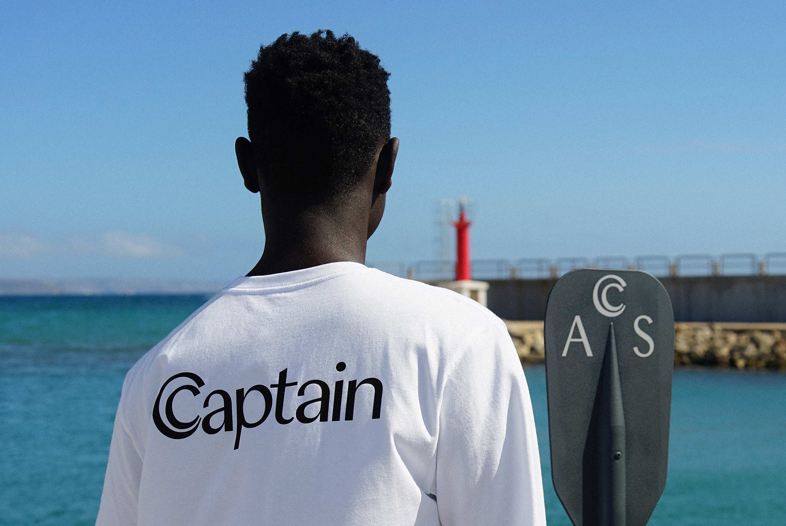
Atlantic is a bold and calligraphic sans-serif typeface designed primarily for fashion and luxury branding. It features a unique blend of calligraphic elements and geometric shapes, with a focus on larger sizes that enhance its display qualities. The typeface has been noted for its distinctive proportions and moderate x-height, making it suitable for high-end applications.
Beaujon, designed by Connor Davenport, is a contemporary serif typeface rooted in the heritage of French Renaissance typography. Inspired by Parmentier’s Garamond, Ganeau’s Vendôme, and the research of Beatrice Warde, it reinterprets classical printing types through a refined and versatile design. Featuring a comprehensive range of weights and optical sizes, from Display to Text, Beaujon combines historical character with modern functionality, making it ideal for editorial design, branding, and sophisticated typographic projects. It is designed for variable font functionality.
Boxi is a display typeface derived from Animo, inspired by Spanish commercial signs known as rótulos. Its character draws from folk improvisation, where broken plexiglass letters were replaced with tape and reshaped by hand. Embracing imperfection and irregularity, Boxi also features a set of cryptic dingbats combining abstract symbols, organic shapes, and psychedelic references, expanding its visual language beyond typography.
The Cigars font is one of Heavyweight's early serif typefaces, inspired by vintage advertising materials, particularly those of the Marlboro brand. It was developed for a specific project and reflects a blend of calligraphic influences and modern design principles, aiming for legibility and versatility. The font has undergone revisions to expand its style range while maintaining its unique character.
Clin is a contemporary interpretation of the Franklin Gothic tradition. It is based on the skeleton of historical american grotesque, but is deliberately less shaded. The strokes are straighter and the contrast more moderate, so that the font appears stable in both small sizes and large black headlines. At the same time, it borrows the principles of neo-grotesque. Balanced proportions, disciplined metrics, restrained details, and legibility without mannerisms.
Atlantic is a display sans serif where notional serifs are replaced with broadening stems. It began as a single thin style, developed for a jewellery designer's practice, and later grew into a fuller family. Its character is defined by a calligraphic quality and a distinctly diagonal axis on round letterforms. Atlantic has appeared in New York Magazine, El País, and M.A.C Cosmetics.
Cigars is one of Heavyweight's earliest serif typefaces, named after an admiration for old Marlboro advertising materials and their use of the Century typeface. Originally a custom design for a Prague philosophy conference, it later grew into a fuller type family in version 2.0. Its defining quality is calligraphic, visible in details: letters like "c", "f", and "r" end with a perpendicular cut rather than a classic terminal.
Nuckle is a grotesk font for text and display. It is Heavyweight's oldest typeface, originally designed in 2011 before the foundry was officially formed. It is a functional grotesque built around an increased x-height, which gives it exceptional legibility at small sizes while maintaining presence at display scale. The difference between uppercase and lowercase is deliberately minimal, placing emphasis on clean, readable accents.
Left is a refined grotesque typeface known for its subtle, almost invisible serifs on the left side of each stem. This design creates a quiet optical tension in text, making it suitable for editorial and identity use. Originally released in 2014, it has been utilized in various publications, including Monopol magazine.
Nuckle is one of the first fonts created by Heavyweight, originating in 2011. It is a functional grotesque typeface designed to meet the demands of contemporary graphic applications, emphasizing legibility and versatility. Nuckle has been used in various high-profile projects, showcasing its strength in both small text and large display settings.
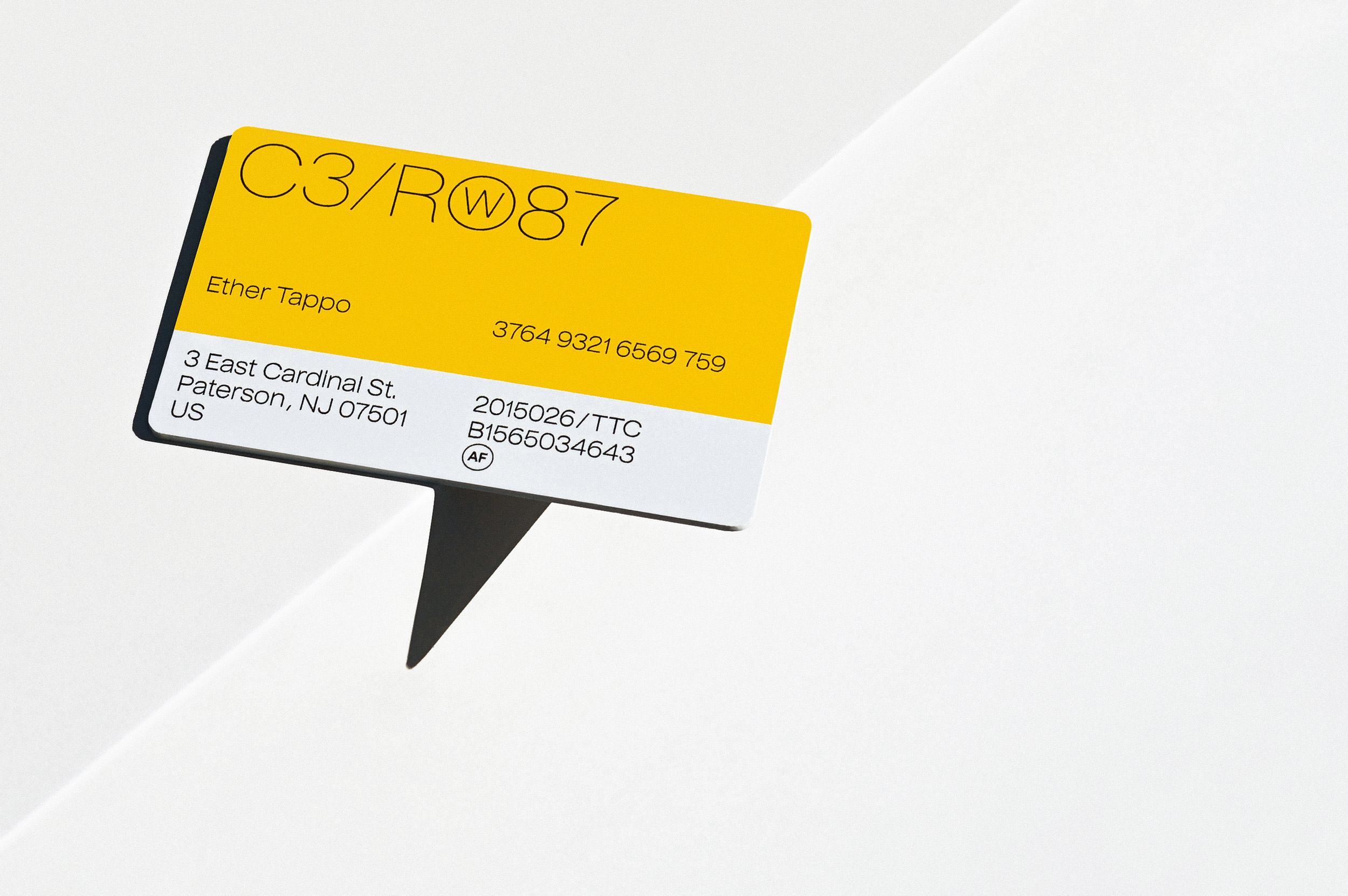
Pano originated as a logotype for a racing bike brand, which gave rise to its characteristically wide proportions. It is a low-contrast sans serif with smooth transitions from arms to stems and vertically terminated strokes. Humanist details like the "a", "s", or ampersand set it apart from geometrically constructed typefaces. Pano excels in display settings: on posters, book titles, and magazine spreads. Its high x-height also makes it viable for shorter text compositions. Available in four styles: Light, Regular, Bold, and Italics.