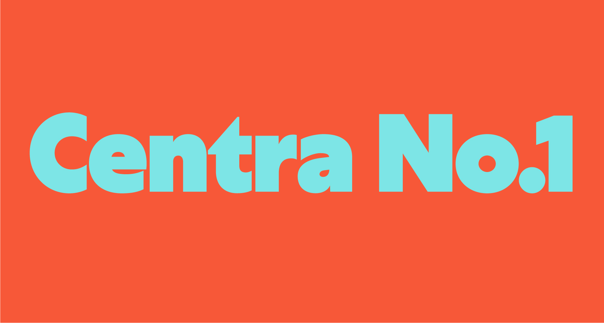
Meet Yocco, the typeface that takes geometry to the max, with barely a hint of contrast. It offers a blend of geometric precision and functional design, striking a harmonious balance between form and readability. Yocco is available as a variable font, offering flexibility through two axes of variation: ‘Weight’ and ‘Lumos,’ as well as in 10 static versions. The Lumos axis feature, aimed at enhancing readability, especially in smaller sizes. This innovative addition subtly refines details such as junctions and contrasts for optimal legibility without compromising on style. This diverse range caters to a wide array of typographic preferences and design requirements, allowing for both display and text usage. What distinguishes it is its deliberate treatment of letter endings. With closed terminals on characters like ‘a,’ ‘c,’ ‘e,’ ‘s’ etc. Yocco achieves a distinctive aesthetic while maintaining legibility. Additionally, Yocco provides an alternative single-storey version of the ‘a,’ further enhancing its geometric qualities and offering designers even more flexibility in their typographic compositions. Whether for digital interfaces or branding projects, Yocco lends itself to crafting modern and original layouts, offering designers the tools to create distinctive visual identities and engaging user experiences.