Info
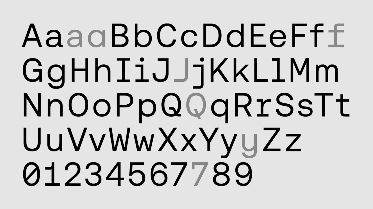
Classification
Licensing
Webfont
Download
Google Fonts
Adobe Fonts
Trend over time
In use
Similar fonts
Helveesti
Dinamo
Publisher
PP Watch
Pangram Pangram Foundry
Mori
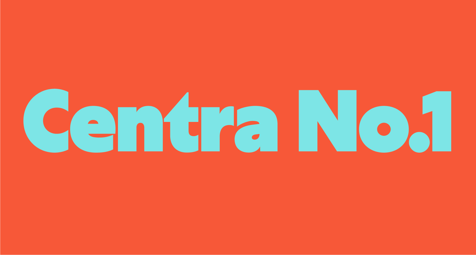
Centra No.1
Sharp Type
Aeonik Fono
CoType Foundry
Sharp Sans
hansom fy
Black[Foundry]