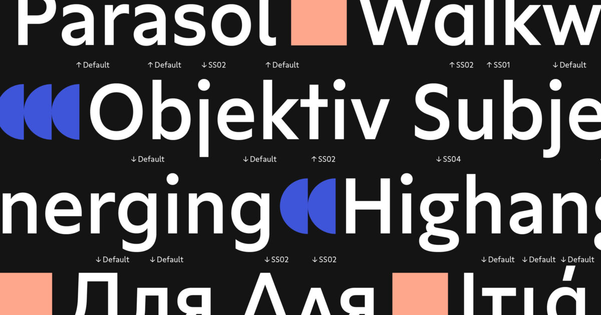
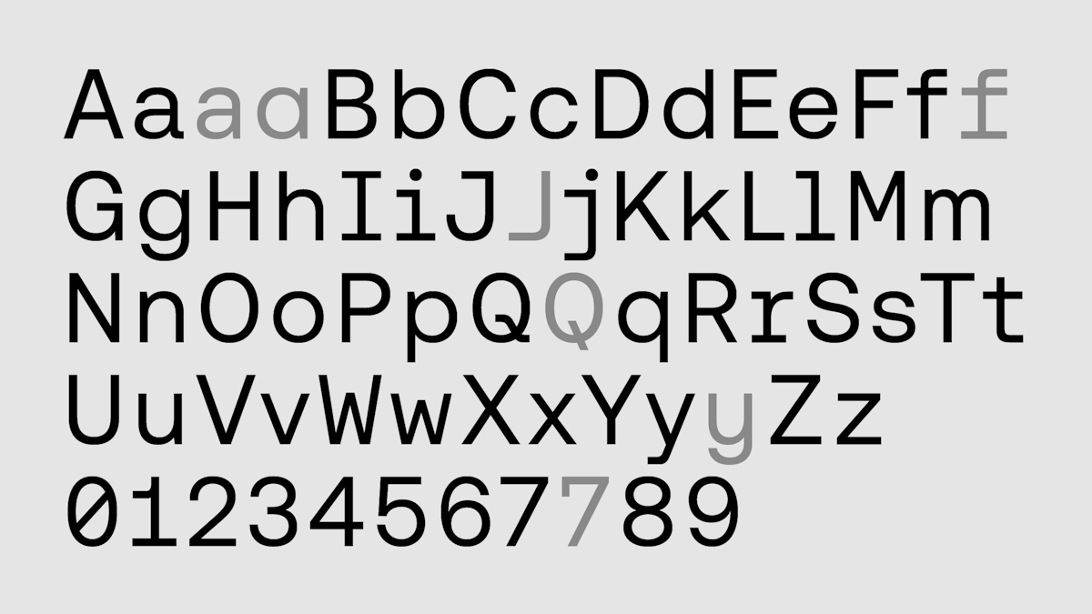
Tosh typeface is a hybridization between geometric mechanical forms and an organic spirit. Its unique and resolutely contemporary DNA is expressed in a sans-serif style and consists of two twin typeface families: Tosh A and Tosh B. Both express themselves with a common language but have their own specificities. Tosh A is the more geometric of the two variants, while Tosh B is more constructed. Their common strength is to play with a combination of forms to create a vibrant reading rhythm. Tosh B has more slab serifs for on-the-fly ligature generation, such as on the "d", "g" and "q", etc. A and B are both raw because their letterforms feature almost no modulation. Tosh A's capital "C", "G", "O", "Q" and lowercase "a" and "e" are almost perfectly round. While Tosh B jettisons that well-trodden geometric path for letters with an even more naïve design language: Typically-circular letters have straight sides there, such as in the diagonal-shaped bowl of the "a" or the flat bottoms on the "b" and "e". In both version, the tops of the lowercase ascenders come to the exact height as tops of the capital letters. Tosh's character set includes support for languages using Latin, Cyrillic and Arabic scripts, ranging on 6 weights (Thin, Light, Regular, Medium, Bold, Black). This panel of weights makes it flexible to different uses and gives voice to the richness of its design. Tosh Regular will provide a perfect readability in a text. The Thin version reveals all the finesse and delicacy behind the apparent rawness of this typeface. While Tosh Black will stand out particularly impactful used as a titling character. The various scripts that Tosh covers also have their own variants between the A and B versions. In Cyrillic, the letter "Že" will have a very graphic and minimalist look in the B version, while the A version will be composed of a flat bar that will give it a robust look. In the same way, the letter "Dé" will have a completely different construction according to the two variants. In Tosh A the design includes a curve that gives its stature a certain elegance, while the B version will show it in a more strict and visually symmetrical version. The Arabic support in the Tosh typeface draws inspiration from the elegant Kufi calligraphy style, seamlessly blending with Tosh's distinctive geometric aesthetic. In Tosh A, we infused elements from simplified Naskh, enhancing its versatility for diverse applications. With Tosh B, we pushed the boundaries further, refining letter shapes with pronounced Kufic influence, amplifying the geometric charm. The meticulous approach in Tosh A and B extends to adapting preferred letterforms across various Arabic languages, ensuring nuanced differences and honoring localized preferences like the final Yeh, which is noticeable between Tosh B and A. Many of Tosh's characters burst out of their boundaries, and this is a key feature of the typeface. Ligatures develop on-the-fly, not just as OpenType substitutions, because part of one letter often overlaps the next. The right side of the "k", for instance – or either side of the "r" – naturally fuses with several other letters, including "i" and "t". The top of Tosh's "f" juts out over the character following it, too. This modern hybrid mixes raw geometry, leading to the unexpected. Tosh B's numerals are particularly expressive, especially the tabular "1", the closed-top forms on the "2", a descending "5" and the flat tops on "3" and "6", along with the bottom of the "9". Tosh A and Tosh B each include discretionary "ct" and "st" ligatures and includes a robust collection of currency symbols. Finally, Tosh has dozens of arrows and other graphic ornaments with designs that are both reduced and playful at the same time.