Designed to work both as an expressive display typeface and as a readable editorial tool, Räder's range spans across 16 carefully crafted weights: from a stripped down hairline cut to the more exuberant and decorative bold. Road signage is something of which we've learned to assume the neutrality: it's ubiquitous, simple and sends an arguably unmistakable message to the viewer. Has it always be like that, though? Vintage signage systems were in fact the result of a graphic compromise between clarity of message and beauty of appearance, as designers understood the importance of wayfinding in the urban identity: Räder is an attempt to bring the craft back to such times. On one hand immediately recognisable, on the other oddly familiar, it draws from a debut-de-siecle aesthetic to spice up the hyperpopular genre of industrial grotesques.
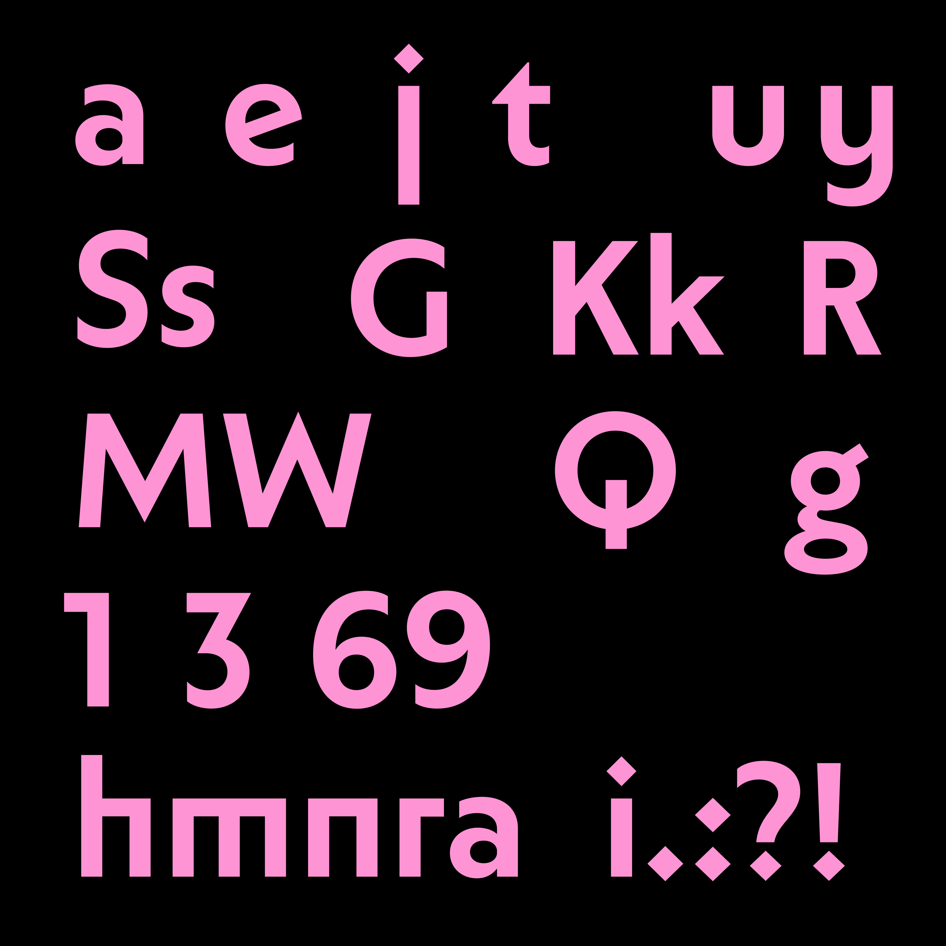
Räder's inner round counters give the feeling of a printed typeface, without compromising its modern look, so you can have the best of both worlds... or should we say the best of both ages?