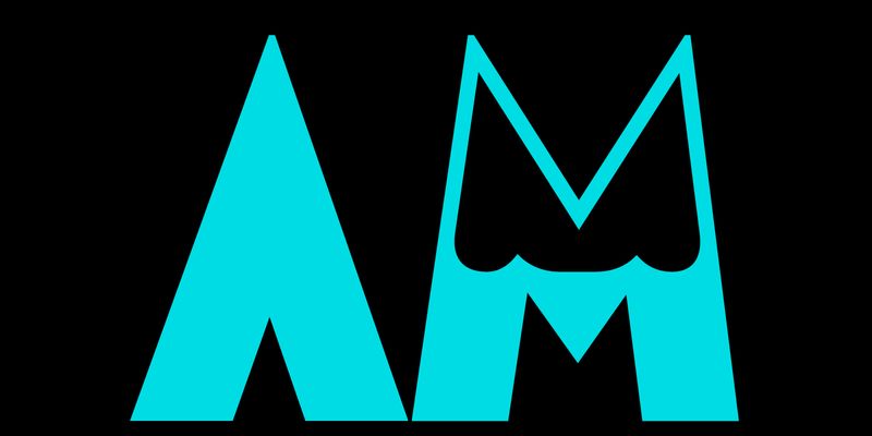
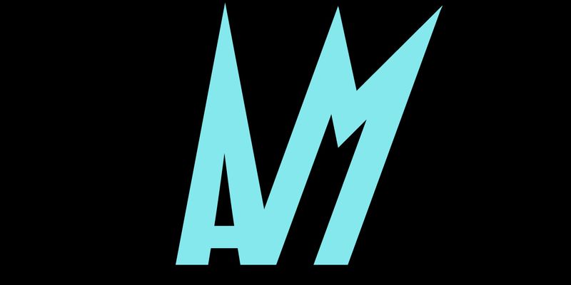
Tripoli is a dark, uppercase sanserif with a strong expressionist feel. Its geometric letterforms feature slightly flattened arches, tiny counters and sharp edges as well as the peculiar sharp triangular shapes in the central strokes of E and F. Some arches have been replaced by curved strokes that become abrupt sharp angles, such as in S and the figure 3. Tripoli was produced as a wood type by Xilografia Italiana (based in Badia Polesine, between Verona and Rovigo), probably shortly after 1934, when the company was founded. We can assume this from the historical context, as Tripoli is the capital of Libya, and Mussolini instigated large-scale immigration of Italian settlers to Libya in the early 1930s (after a war against local insurgents in which Italian troops committed several war crimes). The overall effect is as if Tripoli’s letters were made with hand-held cutting tools; they convey an idea of the ‘unpremeditated and accidental’ as Walter Tracy described Rudolf Koch’s Neuland, or rather the style of lettering that Neuland exemplifies. Neuland was most likely influenced by Viennese artists such as Oskar Kokoschka, with their bold expressionist paper-cut letters. This was a popular style for poster lettering throughout Central Europe in the early decades of the 20th century, and it is the style on which Tripoli was designed. True to the original, the AM Tripoli digital revival features characters that have been carefully rectified and fine-tuned. As its designer Alessandro Bombieri explains, ‘In addition to making necessary visual improvements, many of the “flaws” in the original outlines have been rationalised to ensure they are visible in the digital environment without being obtrusive or distracting. Letter spacing has been improved and tightened to align with contemporary typesetting standards.’