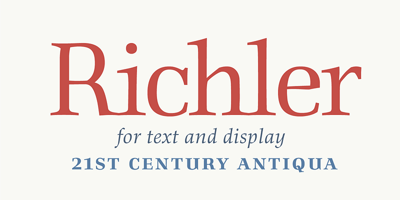
Info
Classification
Licensing
Webfont
Download
Google Fonts
Adobe Fonts
Trend over time
In use
Similar fonts
Riquet
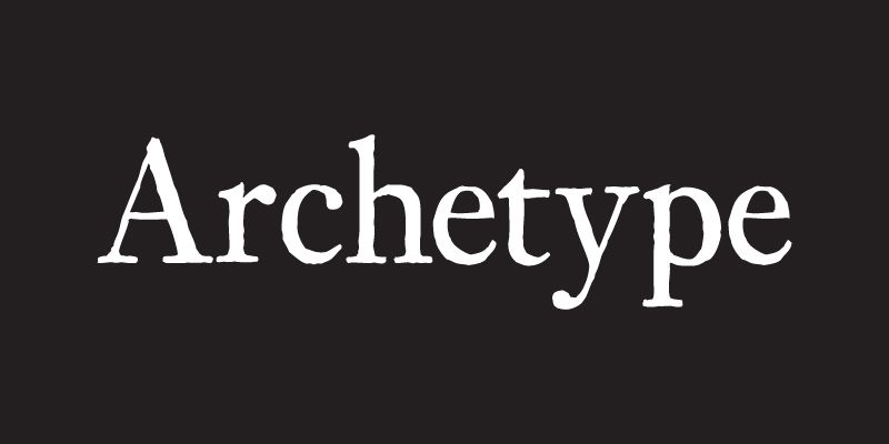
Archetype
Bacasime Antique
AW Conqueror Stincilla
Typofonderie
Le Monde Livre
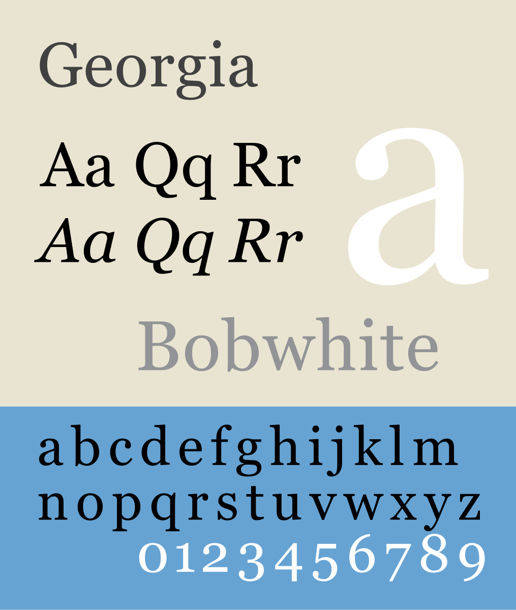
Georgia
Microsoft
Fanwood Text
Brando
Bold Monday