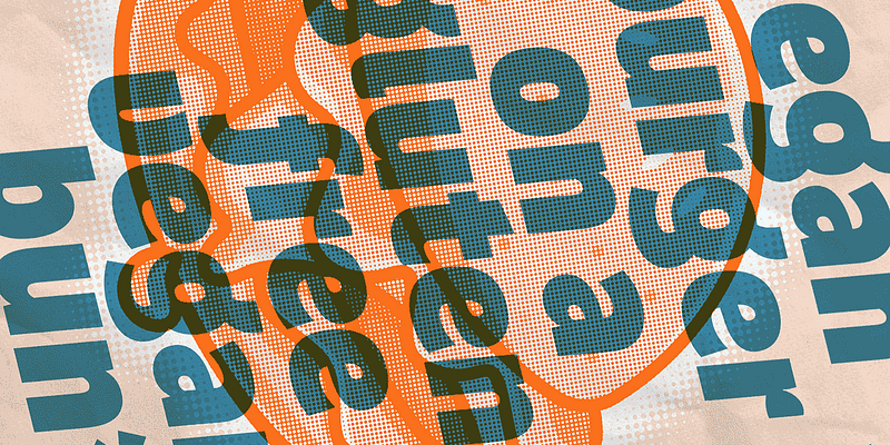
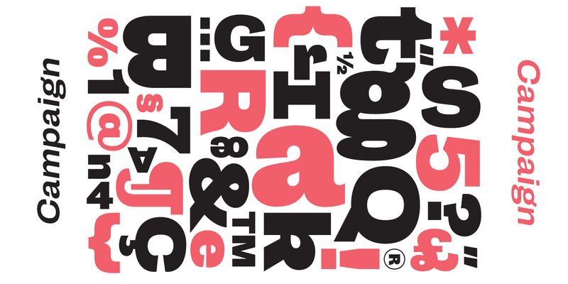
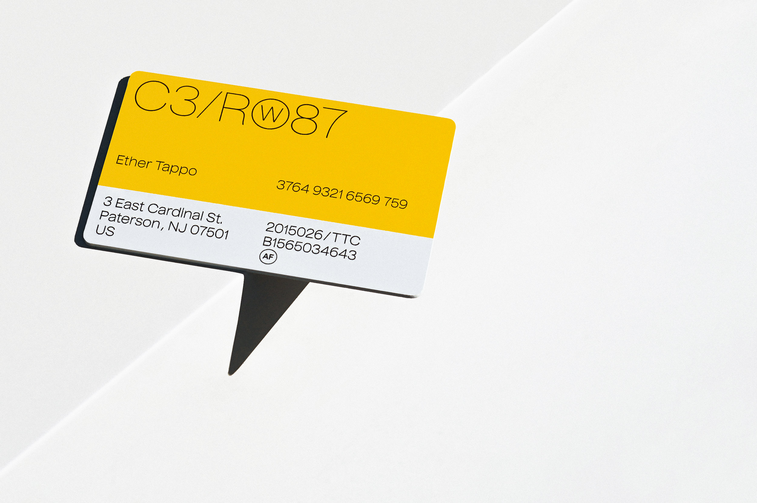
You may recall Pinup by Pieter van Rosmalen among the first Bold Monday releases. It was informal and friendly, but consisting of only one style. More than 10 years later, it has grown into two comprehensive type series: one very practical and still fun, one very fun and still quite practical: Puffin and Puffin Arcade. The extended “normal” family consists of Puffin, Puffin Display, and Puffin Display Soft, each available in seven weights plus italics. Plain Puffin is the most tame; a versatile humanist sans with generous spacing and pronouncedly oblique italics (15°) that is well-suited for on-screen reading and user interface design. Puffin Display and Puffin Display Soft, in comparison, are more flavorful: Distinctly curved letterforms, especially in the italics, and rounded terminals in Puffin Display Soft creates a comfortable first-name-familiarity with it. The Display styles have a taller x-height and slightly tighter spacing that fit all kinds of personable applications in medium to large font sizes. And for an extra dose of playfulness—be it in posters or video games—combine these with Puffin Arcade. For additional license options like app, enterprise, multi-user, and self-hosted web, visit [Puffin Display on Type Network](https://store.typenetwork.com/foundry/boldmonday/series/puffin?family=puffin-display).