Info
Classification
Licensing
Webfont
Download
Google Fonts
Adobe Fonts
Trend over time
In use
Similar fonts
Menca
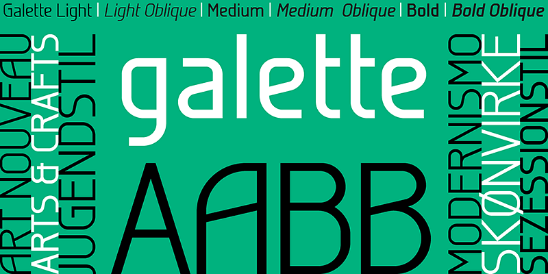
Galette
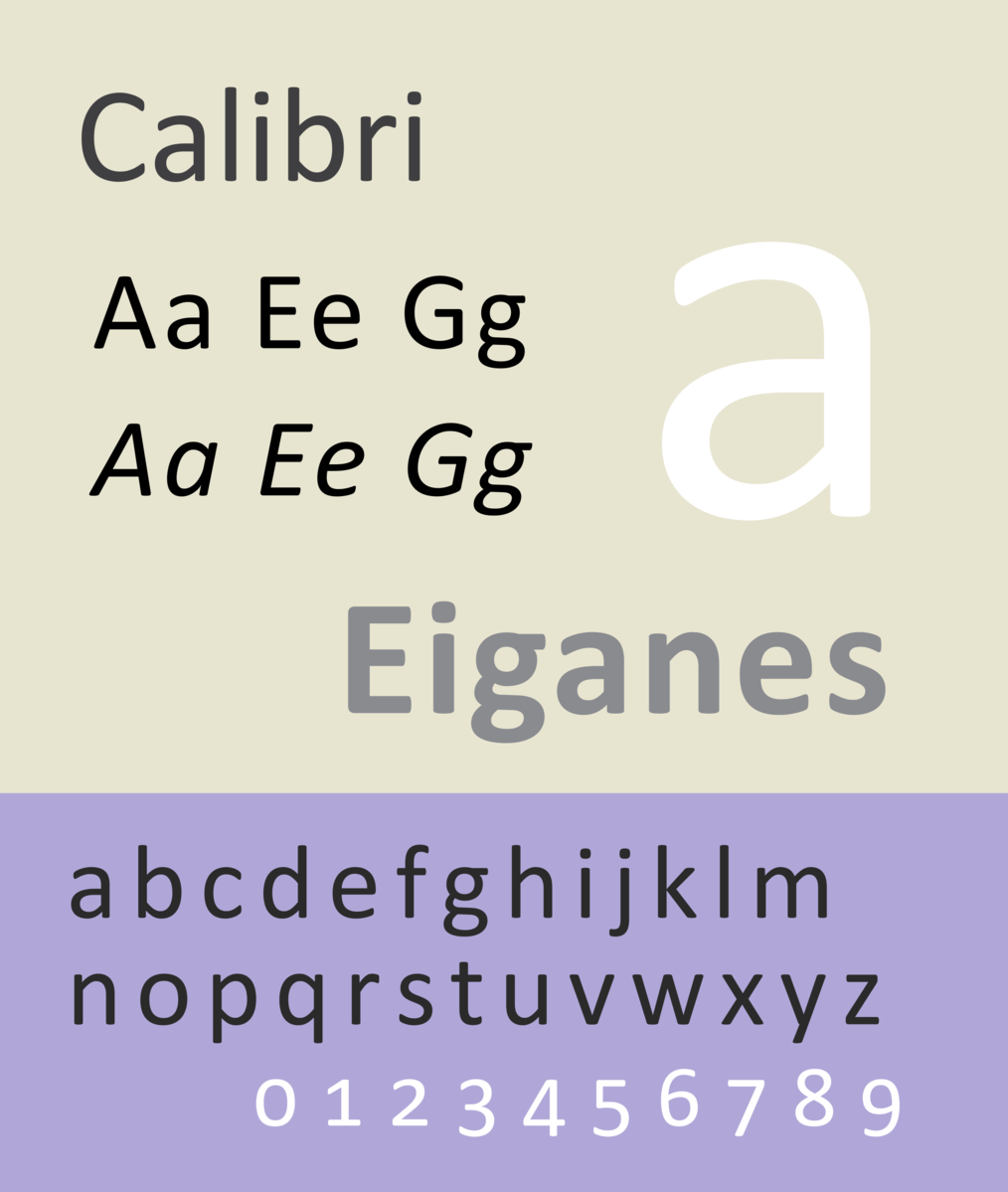
Calibri
Microsoft
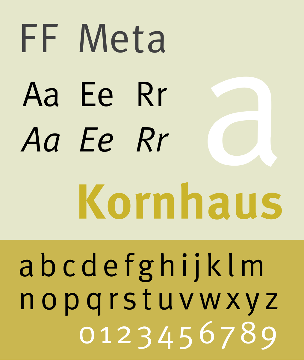
FF Meta
FontFont
Rubik Bubbles
Krona One
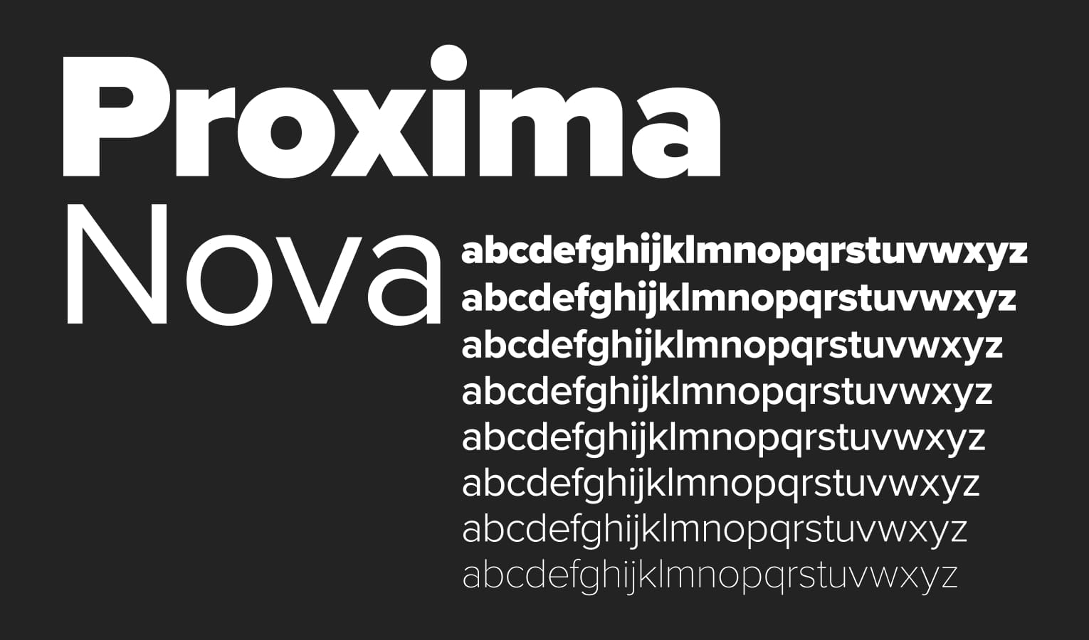
Proxima Nova
Mark Simonson Studio
Audace
Typofonderie