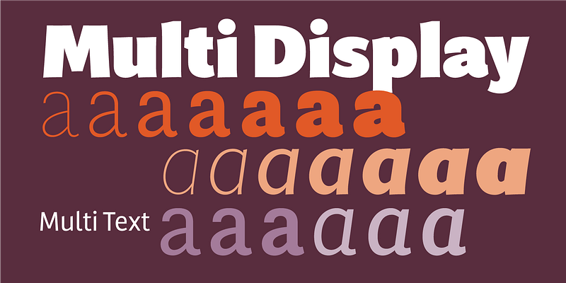
Laura Meseguer’s first extensive type family, Multi was originally commissioned in 2011 by a publisher of Dutch regional newspapers. The aim in developing Multi was to match the serif typefaces used for a comprehensive layout overhaul project supervised by editorial art director Luis Mendo. Keywords provided by the client were unequivocal: warm, dynamic, optimistic, friendly, and human. Meseguer initially designed two series: Multi Text, with two weights in roman and italic, and Multi Headline, with six roman styles. Since that commission, Meseguer has considerably expanded the character set and family. Multi Text now comprises three weights (roman and italic), and Multi Headline was renamed Multi Display (seven weights in roman and italic). Like most Meseguer typefaces, Multi is bursting with vitality. Its distinctive phrasing lies between humanist and glyphic, exploring uncharted territory. The design is pragmatic, yet not rigid, and gently graced with tiny incised touches; Type-Ø-Tones 2016 For additional license options like app and enterprise, visit Multi Display on [Type Network](https://store.typenetwork.com/foundry/type-o-tones/fonts/multi-display).