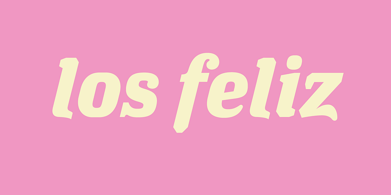
Today, as in the 70s, designers again prefer Helvetica and other bland looking sans serif typefaces. These fonts impregnate print work with the veneer of professionalism by looking stylistically detached, which is now very cool. Los Feliz stands in direct opposition to this trend. When looking at the individual characters of Los Feliz, all you You become aware of the little details that make it so difficult to draw perfect letter shapes. But when you look at Los Feliz set in text, these irregularities largely disappear. Obviously this typeface was drawn by someone who knows exactly how to subvert notions of correct design by being in complete control while giving the impression he is not. ---------- ###Download the PDF [here](https://www.emigre.com/PDF/LosFeliz.pdf)