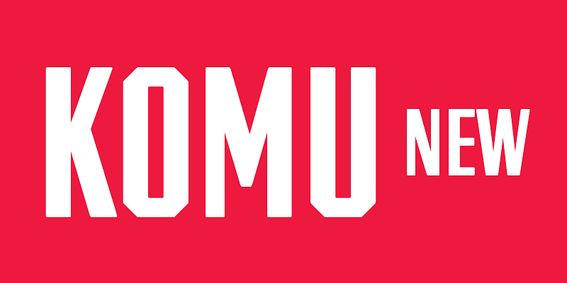
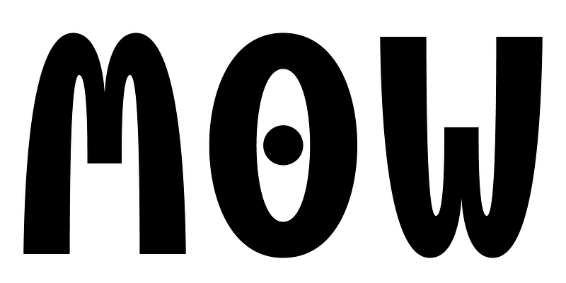
Komu is a revival of the style of letters that was frequently used on billboards during the socialist period in the former Czechoslovakia. They were usually uppercase letters made of paper and covered with a layer of aluminum foil. People just had to pick the letters (that included a variety of widths and sizes) out of a box and pin them up on a styrofoam billboard, thus making it easy to announce any event. Komu consists of two styles. Version A is squarish and includes some distinctive characters (K, 5, narrow E, and idiosyncratic diacritics) while version B is rounded with mostly uniform widths (with the exception of E, F and L). The optical disparity of the original lettering style was retained, so that some of the characters look slightly darker than others. Komu is intended to be used on posters, books and other products about Socialism in our region and includes full support for languages based on latin script.