Info
Classification
Licensing
Webfont
Download
Google Fonts
Adobe Fonts
Trend over time
In use
Similar fonts
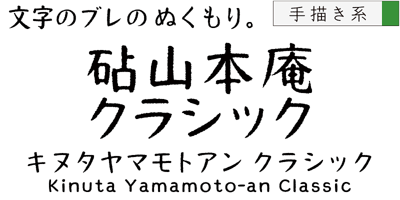
Kinuta Yamamotoan Classic StdN
September N
Akaya Kanadaka
Chokokutai
Anisette
Typofonderie
Rekall
Bold Monday
Jurriaan 3D
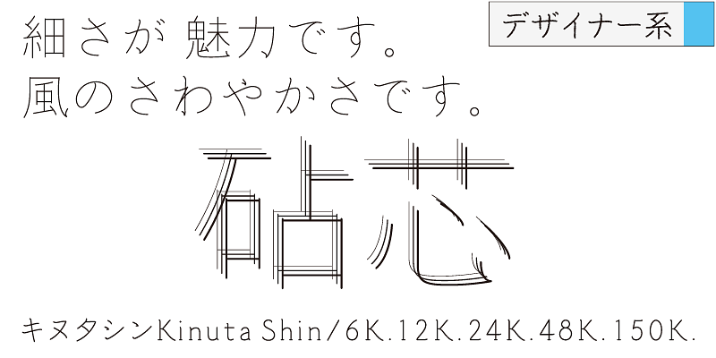
Shin
Hvnter