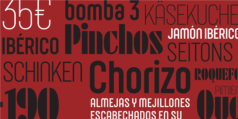
Joost is not just a study on the structure and development of the classic Bauhaus alphabets. It also represents Josema Urós’ drive to transform those shapes into a usable font family. The first version of Joost, published in 1995, stringently adhered to the concept of Herbert Bayer’s Universal Alphabet, which contains only lowercase characters. Urós went above and beyond that in his interpretation, though, with diacritics, punctuation, and a full 256-character ASCII table. The second Joost, released in 2009, incorporated uppercase characters and some serious design improvements. The Joost of 2016 has expanded even further; it now includes a complete character set of Central European and OpenType features, as well as a new system of curves. The Bauhaus continues to evolve; Type-Ø-Tones 1995–2017 For additional license options like app and enterprise, visit Joost on [Type Network](https://store.typenetwork.com/foundry/type-o-tones/fonts/joost).

