Info
Classification
Licensing
Webfont
Download
Google Fonts
Adobe Fonts
Trend over time
In use
Similar fonts
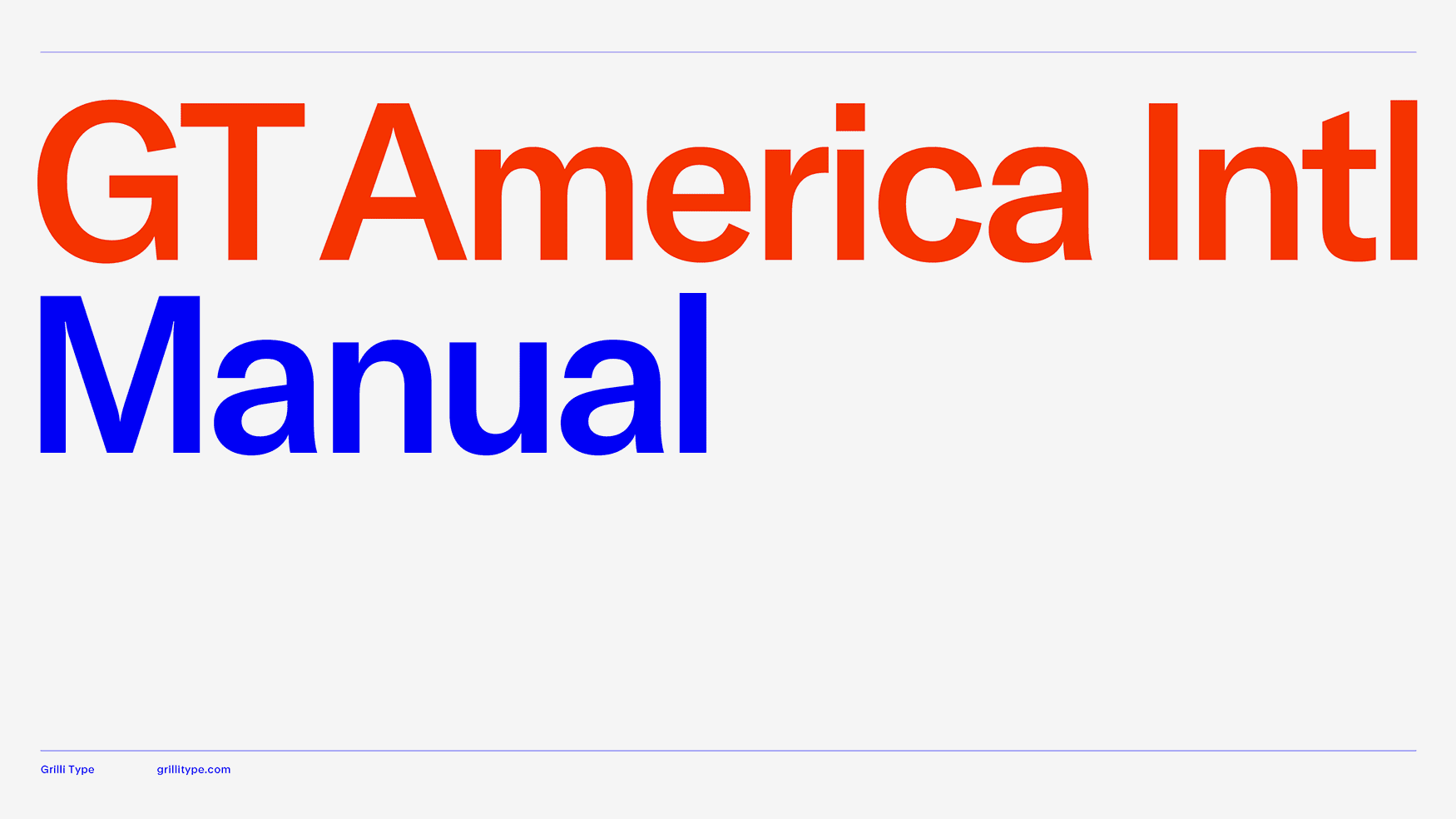
GT America Intl
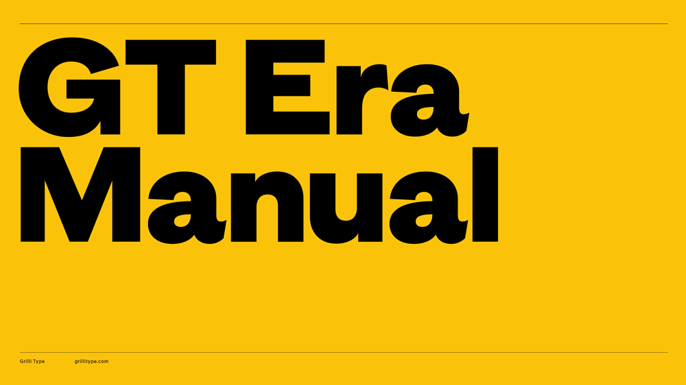
Grilli Type
GT America
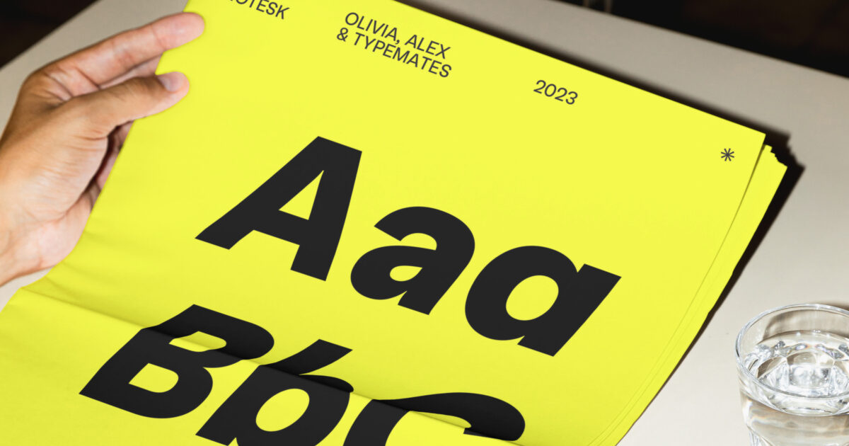
easy grotesk
TypeMates
Gatwick Collection
Pangram Pangram Foundry
National
Klim Type Foundry
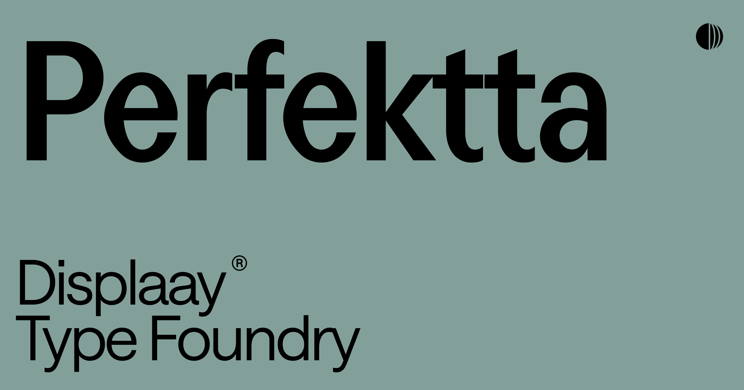
Perfektta
Displaay
Greed
Right Grotesk