Info
Classification
Licensing
Webfont
Download
Google Fonts
Adobe Fonts
Trend over time
In use
Similar fonts
Google Sans
Google
Gothia Sans
Letters from Sweden
Royal Gothic Family
Commercial Type
Ysans
Typofonderie
Swedish Gothic
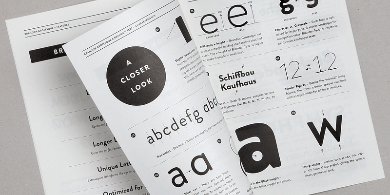
Brandon Grotesque
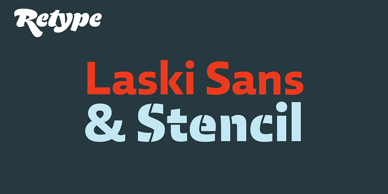
Laski Sans
Akhen Condensed