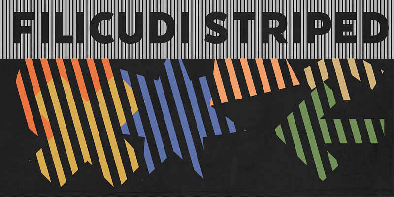
The Tipoteca Series is a family of three typefaces resurrected from the rich wood type collection of the popular letterpress museum and archive [Tipoteca Italiana](http://www.tipoteca.it/en/) in Cornuda, Italy. This explosive series marks vol. II of Adobe’s [Createfulness](https://www.adobe.com/de/creativecloud/createfulness.html) campaign, following the digital revival of 1920s graphic elements, symbols and pictograms from a handful of European metal type foundries, including Deberny & Peignot, Nebiolo and Trennert & Sohn. In the spring of 2019, the design team of [p98a.berlin](https://www.p98a.com/about) rediscovered Tipoteca’s expressive wood type alphabets from various manufacturers, curated a small selection and made letterpress proofs from the original wooden letters for the purpose of restoring them digitally. Berlin-based type designer [Ulrike Rausch](https://fonts.adobe.com/designers/ulrike-rausch) carefully redrew the alphabets, expanded the character sets and added stylistic alternates as well as other OpenType features. Filicudi is a two-layer display typeface with roots from Milan. While the weights Solid and Striped are each extraordinary solo artists, the latter marks the more exceptional character—yet they unfold a remarkable relationship as a duo. Filicudi Striped was originally conceived under the less spectacular name “no. 344”, mentioned as part of a larger multi-layered family in a 1930s type specimen catalogue of the Xilografia Milanese. It follows a style that was popular among type foundries in the 1930s all over Europe. Filicudi is ideal for use in large sizes, suited for announcements, advertising, and movie posters. Its remarkable feature is the ability to design banners, with several terminals such as arrows, wedges and semi-circles to chose from.