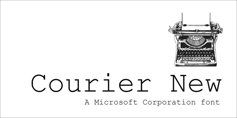
Courier New is a monospaced typeface – that is, every letter is exactly the same width. They look like they were typed on a typewriter, because that’s exactly where the typeface came from: the original Courier was designed for IBM typewriters. Courier New has fairly wide letters, so it tends to sprawl across the page. For many years, it has been the default choice for manuscripts that authors send to publishers, because at 12-point it’s readable and doesn’t cram too many words onto each line. It is very appropriate for correspondence, or for any document that you’d like to look as though it came from a typewriter. Because it is monospaced, all the numbers and letters will line up vertically. The original Courier was designed by Howard “Bud” Kettler in 1955 or 1956 for IBM typewriters and later revised with input from type designer Adrian Frutiger for IBM’s Selectric typewriter series, where it became the most common office typeface. It was adapted as a computer typeface to become one of the core Windows typefaces.