Info
Classification
Licensing
Webfont
Download
Google Fonts
Adobe Fonts
Trend over time
In use
Similar fonts
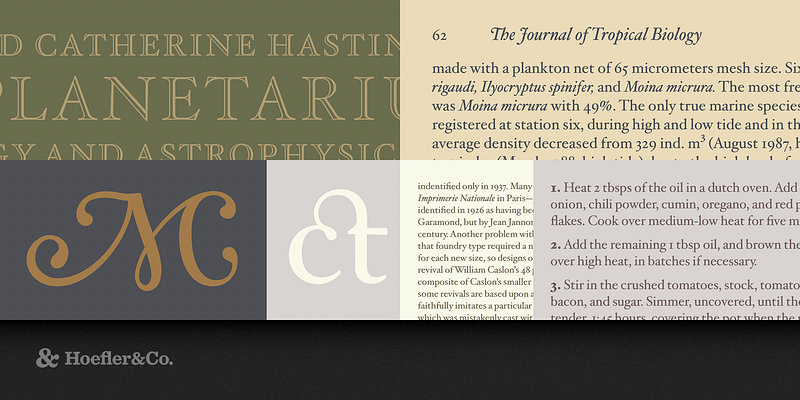
Hoefler Text
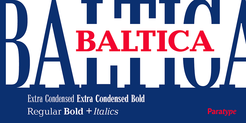
Baltica
AW Conqueror Stincilla
Typofonderie
Times New Roman
Microsoft
Retiro
29LT Azahar Text LC
29LT
IM Fell French Canon SC
29LT Azahar Text AL