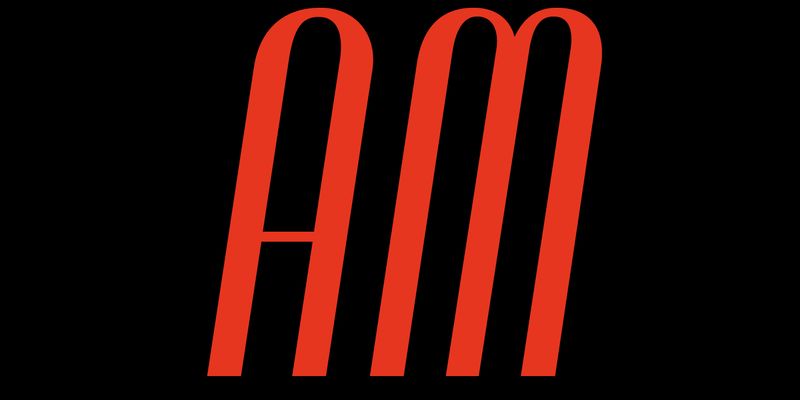
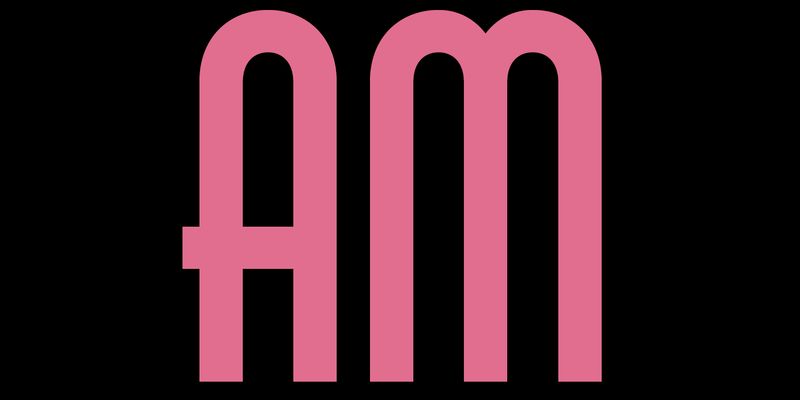
Lombardia was an all-caps condensed sanserif with a modular design, a high thick/thin contrast and a distinctive 8-degree slant. Its geometric rhythm is emphasised by the swelling at the terminals of the letters, while another distinctive feature is the small curve at the central intersection of letters such as B, K and R. Lombardia was a metal type patented by Pierallini, Turchi & Co. in Florence in 1941. It was released in six body sizes ranging from 24 to 72 points. Although little is known about the type foundry, which was later acquired by Azzaro in Rome, the patent provides information about its designer, Egidio Bozzolo. Bozzolo was a graphic designer (he designed a cover of Campo Grafico) and a member of a group of modernist-inspired graphic designers (including Antonio Cane, Stanislao Defilippi, Ezio D’Errico and Paolo Alcide Saladin), who authored Tipo. Impostazioni tipografiche create e realizzate dal Gruppo Cinque T., a stylish essay on modern industrial graphics published in 1939. Lombardia’s design features reflect the spirit of late 1930s Italy, with geometric letterforms recalling Nebiolo’s popular Neon, while Lombardia’s high contrast and the rounded intersection of B, K and R are reminiscent of Nebiolo’s other best seller, Fluidum. The AM Lombardia digital revival closely mirrors the original design regarding uppercase, figures and punctuation. Curves and thicknesses were reviewed and fine-tuned – and these are standard procedures for adapting printed letters to the digital environment. ‘Since Lombardia was caps-only – say the designers, Carlotta Albiero and Luciano Perondi – we decided to add the lowercase letters that are missing in the original model following a similar process to that adopted by the Fundición Tipográfica Nacional (Madrid): in 1954 they released Ilerda, very similar to Lombardia, though darker and less slanted, and with lowercase letters. Alternates for a, k, and t were also provided, along with alternate E and M, which were part of the original typeface. OpenType Features: Case-sensitive Forms ss01 – Alternative E, M ss02 – Alternative a, k, t